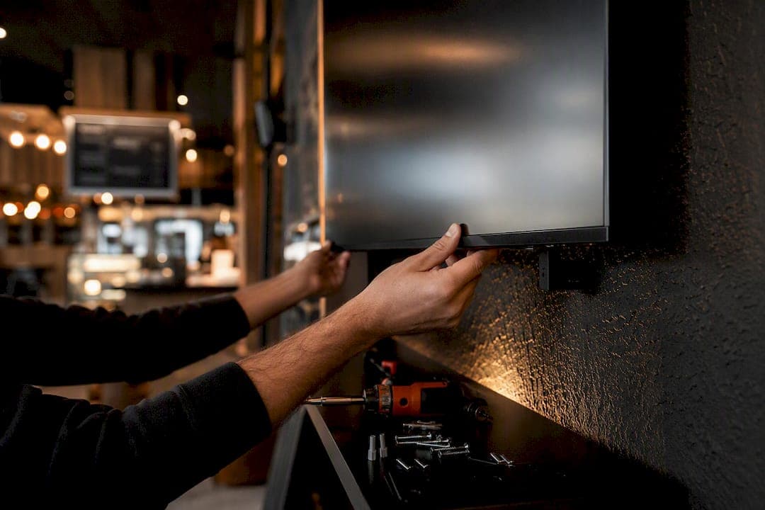
Start with flash-sale countdowns, menu or price boards, live KPI dashboards, social walls, and QR promotions. These five cover sales, information, engagement, and measurement all at once, and they're the fastest way to prove a screen is worth its wall space.
Most businesses that buy a screen never plan what goes on it, then wonder why it gets ignored after week two. The hardest part of digital signage isn't the hardware, it's deciding what to display, and a stale or blank screen actually does more damage to your brand than no screen at all. Here's a shortlist you can put into rotation this week, organized by where it lives and what it's supposed to accomplish.
- Flash-sale countdown: entrance or storefront window, objective is sales, creates urgency for time-limited offers.
- Menu or price board: point-of-sale or counter, objective is information, removes staff repetition on pricing questions.
- Live KPI dashboard: sales floor or office, objective is operations, keeps teams focused on real numbers instead of guesswork.
- Wayfinding directory: lobby or entrance, objective is information, cuts down "where's the washroom" interruptions at reception.
- Social wall (UGC feed): waiting area or lobby, objective is engagement, turns customer posts into free advertising.
- Event notice board: hallway or common area, objective is information, keeps everyone aware without a mass email.
- QR-code promotion: checkout or table tent screen, objective is sales, links directly to a trackable offer.
- Employee recognition slide: break room, objective is engagement, costs nothing and improves morale measurably.
- Weather or transit widget: entrance or lobby, objective is information, gives people a reason to glance at the screen daily.
- Product spotlight reel: sales floor, objective is sales, rotates featured inventory without reprinting signs.
Pro Tip: Pick two ideas from this list, run them for seven days, and track one number: QR scans or a simple headcount of people who stop and look. That's your baseline before you build anything bigger.
Key Takeaways
Effective digital signage content combines objective-based ideas, one-message-per-slide design, a 60 to 120 second rotation, and QR-based tracking to prove what's working.
| Point | Details |
|---|---|
| Start with high-impact content | Flash-sale countdowns, menu boards, KPI dashboards, social walls, and QR promotions cover sales, information, engagement, and measurement immediately. |
| Sort content by objective | Group every idea into sell, inform, engage, or operate so no slide tries to do three jobs at once. |
| Design for a three-second glance | Use one message per slide, 15 to 20 words maximum, and WCAG AA contrast for walk-by legibility. |
| Run a 60 to 120 second loop | Build 6 to 10 slides at 8 to 20 seconds each, update weekly, and audit the full playlist quarterly. |
| Track QR scans and UTM links | Measure scan conversion and adjacent POS lift to know which creative and placement actually perform. |
Table of Contents
- Digital signage content ideas organized by objective: sell, inform, engage, operate
- What do good digital signage examples look like by industry?
- What design rules make digital signage content actually readable?
- How often should you update your digital signage playlist?
- What tools and integrations make signage content easier to manage?
- How do you measure whether digital signage content is working?
- What do installers actually notice about digital signage content?
- How do you tailor digital signage content to different audiences and locations?
- Are there legal or accessibility rules for digital signage content?
- How do you use calls-to-action effectively on digital signage?
- What are the most common digital signage content mistakes?
- Why the "post it and forget it" approach to signage always fails
- Sources
Digital signage content ideas organized by objective: sell, inform, engage, operate
Every slide you put on a screen should serve exactly one business goal. When content tries to do three jobs at once, it usually does none of them well. The cleanest way to build a content calendar is to sort every idea into one of four buckets, then rotate between them so the screen never feels like a single-purpose billboard.
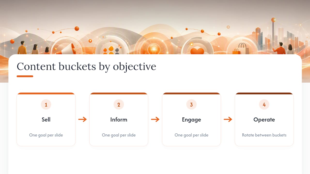
1. Content that drives sales
Retailers and restaurants get the fastest return from signage that nudges a purchase decision at the exact moment someone is deciding. A content mix that rotates promotional material with informational and engagement content performs better than repeating one type on a loop, so treat sales content as one ingredient, not the whole meal.
- Flash-sale countdowns with a visible clock create urgency that a static poster can't match.
- QR-code promotions tied to a specific discount code let you measure exactly how many people acted.
- Product spotlights rotate seasonal or overstocked items without printing new signage every time inventory shifts.
- Upsell prompts near checkout ("add a side for $2") work because they catch attention during a pause in the transaction.
- Loyalty program CTAs synced with your point-of-sale system can display real-time point balances or member-only deals.
2. Content that informs and orients
Informational content is the workhorse of any signage deployment. It's rarely exciting, but it's what earns the screen a permanent place on the wall because it replaces something people used to ask a staff member.
- Menus and price boards, updated centrally so every location shows the same numbers.
- Opening hours and holiday schedule changes, especially useful around statutory holidays.
- Wayfinding and directory screens in multi-tenant buildings, malls, or hospitals.
- Live transit and weather widgets near exits, which give commuters a reason to check the screen daily.
- Wait-time or queue displays at service counters, pharmacies, or clinics.
3. Content that engages and entertains
Engagement content earns its keep by making people want to look, even when they have no immediate transaction to complete. A short looping video under 30 seconds paired with live data consistently beats a static image for recall and follow-through action, which is why the strongest engagement slides almost always involve motion.
- Social walls pulling from a branded hashtag, moderated before display.
- Trivia or poll slides that reward correct answers with a small perk.
- User-generated photo galleries from events, contests, or customer submissions.
- Short looping product or brand videos, capped at 30 seconds so they don't overstay their welcome.
4. Content that supports operations
Not every screen faces a customer. Internal signage in offices, warehouses, and back-of-house areas has its own job: keep staff informed without adding another email nobody reads.
- Live KPI dashboards in sales bullpens, showing today's numbers against target.
- Meeting-room screens displaying the current booking and next available slot.
- Employee recognition slides that rotate names, anniversaries, or shoutouts.
- Safety and override alerts that can interrupt the regular playlist during an emergency.
What do good digital signage examples look like by industry?
Generic content ideas only get you so far. The best digital signage examples are specific to the physical space and the moment a customer or employee walks past the screen. Here's how the four content buckets translate across common industries.
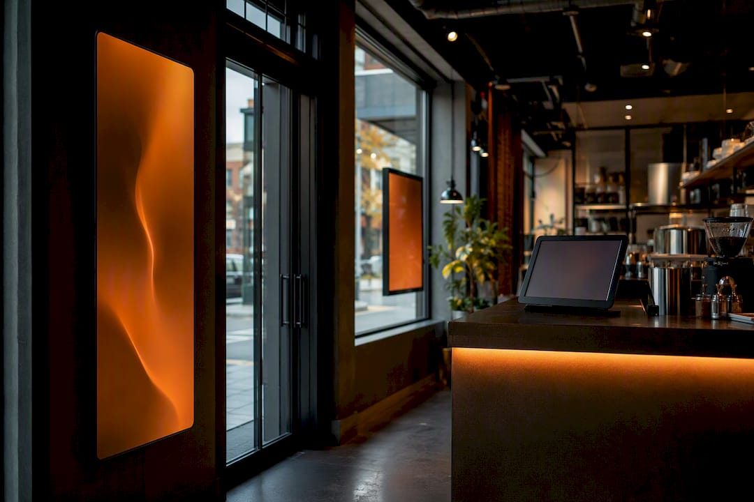
Retail benefits most from layered placement: an entrance screen running a countdown or new-arrival promo, a window-facing display visible from the sidewalk to pull foot traffic, checkout-adjacent slides suggesting an upsell, and fitting-room screens cross-selling accessories to whatever's already in the cart.
Corporate offices tend to split signage into two very different jobs. Lobby screens greet visitors and reinforce brand identity, while break-room and hallway displays carry HR announcements, birthdays, and event reminders. Meeting-room panels showing live booking status prevent the awkward door-knock-during-a-call problem, and KPI dashboards placed in sales areas keep numbers visible without another status meeting.
Hospitality properties lean on wayfinding and amenity overviews, since guests are often unfamiliar with the building. Event schedules near elevators or lobbies, local attraction guides in guest lounges, and restaurant menus that update by daypart all reduce front-desk questions. Restaurants specifically benefit from menu boards that shift automatically between breakfast, lunch, and dinner pricing, a topic covered in more depth in JupiterAV's guide to restaurant digital signage installs.
Education settings use signage for exam schedules, timetable changes, and club promotion loops in hallways, plus student work showcases near entrances that give visiting parents something to look at besides a bulletin board.
Healthcare facilities need a lighter touch. Queue and wait-time displays reduce perceived delay, calming background videos (nature scenes, slow motion, no jarring cuts) ease waiting-room tension, and check-in instructions paired with safety or infection-control messages keep patients oriented without a staff member repeating themselves all day.
Houses of worship use countdown timers before service start, weekly announcement loops, and sermon-series branding that ties visual identity to whatever topic is running that month.
What design rules make digital signage content actually readable?
One message per slide, every time. That single rule prevents more signage failures than any other design choice, because a screen someone glances at for three seconds while walking past can't compete with a slide trying to communicate a promotion, a phone number, and a tagline simultaneously.
- Keep headline-first copy to a short length per slide so it reads in a single glance.
- Follow WCAG AA contrast guidance and size text so it's legible on a 1080p display from typical walk-by distance, then actually test it by walking past the screen yourself.
- Use 1920×1080 landscape for wide-format screens and 1080×1920 portrait for narrow hallway or kiosk displays, and design assets to that exact aspect ratio rather than stretching a square image.
- Export video as optimized MP4 files and compress images so they load instantly on refresh, since a slow-loading slide often just displays a grey box.
- Keep motion subtle. Loops under 30 seconds hold attention; aggressive animation or flashing transitions tend to push people away rather than pull them in, according to design guidance on slide length and template reuse.
- Build 3 to 4 master templates with your logo safe zone, primary colour, and headline font locked in, so weekly updates take minutes instead of a full redesign, a practice recommended by Texas A&M's Marketing & Communications digital signage guidelines.
Pro Tip: Print a slide at actual screen size, tape it to the wall, and walk past it from across the room. If you can't read the headline in three seconds, the font's too small or there's too much text.
The businesses that struggle most with digital signage almost always skip the template step. Building each slide from scratch guarantees inconsistent fonts, colours, and layouts within a month, and that inconsistency is what makes a screen look neglected even when the content itself is fresh.
How often should you update your digital signage playlist?
A playlist with 6 to 10 slides running 10 to 12 seconds each creates a 60 to 120 second loop, which is roughly how long most viewers actually stand near a screen before moving on. Go longer than that in a high-traffic corridor and you risk showing someone slide one again before they've left.
- Set slide duration by content type. Text-only slides need 8 to 12 seconds to read comfortably; slides with more detail (a full menu, a multi-line announcement) need 15 to 20 seconds; video always plays its full length regardless of the rest of the loop.
- Build a content mix ratio. A workable starting split is roughly 40% promotional, 30% informational, and 30% engagement, then adjust based on which slides get the most attention once you start measuring.
- Set an update cadence. Refresh promotional slides weekly, informational content monthly (hours, menus, policies), and do a full quarterly audit of the entire playlist.
- Block calendar time for it. Fifteen to twenty minutes a week is usually enough to swap a slide or two; the quarterly audit is where you actually delete anything that's gone stale, since dayparted, rotating content consistently outperforms a playlist that repeats the same handful of slides indefinitely.
Corridors and narrow walkways should run shorter loops than lobbies, since people move through them faster and rarely stop.
What tools and integrations make signage content easier to manage?
A signage CMS is the piece of infrastructure that turns a one-off slide deck into an actual content operation. Most platforms in this category give you remote scheduling across multiple screens, zone-based playlists (so the lobby shows different content than the break room without manual swapping), and API-driven widgets for anything that needs to update itself. Buyer feedback on signage platforms consistently flags remote scheduling and social feed widgets as the features people actually use day to day, rather than the flashier features vendors lead with.
Live-data integrations are where signage stops being a slideshow and starts being useful in real time. Weather APIs and transit feeds update automatically. Dashboard tools like Power BI or Tableau can push live sales or operational numbers straight to a screen. Calendar syncing pulls event details from your existing scheduling system instead of someone retyping them.
Social walls need a moderation layer, whether that's a manual approval queue or a keyword filter, since an unmoderated hashtag feed on a public screen is a risk you don't want to discover live. QR-code generators paired with UTM tagging let you trace every scan back to the specific slide that produced it, which matters enormously once you start measuring performance.
- Repurpose existing website banners and social media posts instead of designing from zero for every screen.
- Build a small set of reusable templates in Canva sized to your screen's exact aspect ratio.
- Batch-export a month of slides in one sitting rather than logging in weekly to create something new, a workflow shortcut that saves significant production time compared to building each asset individually.
How do you measure whether digital signage content is working?
You don't need a data science team to prove a screen is earning its spot. Four metrics cover almost every situation: QR or scan conversion rate, any measurable uplift in nearby point-of-sale conversion, dashboard or kiosk view counts if your CMS tracks them, and simple dwell-time proxies from whatever analytics your display vendor offers.
The fastest way to test a new idea is a straightforward split. Run one creative on one screen and a different creative on an adjacent screen, or alternate two creatives by day, then compare QR clicks or UTM-tagged link conversions between the two. Attribution gets far easier once every promotional slide carries its own UTM-coded QR link or a unique POS promo code, since that turns a vague "did the screen help?" into a number you can actually check.
- Give a test at least a full week, and longer for anything with a weekend or weekday-only pattern, before drawing a conclusion.
- If a creative clearly outperforms its counterpart, scale it to more screens before you touch anything else.
- If two creatives perform about the same, the placement is probably the ceiling, not the message, so test a new location before writing new copy.
What do installers actually notice about digital signage content?
Screen height and viewing angle decide whether great content ever gets seen. A gorgeous slide mounted too high above eye line, or angled for a room that's rarely used the way it was designed, gets ignored regardless of what's on it. JupiterAV's installers see this constantly, and the same logic that applies to getting TV mounting height right in a living room applies just as much to a lobby or break-room display.
Beyond mounting, the operational side matters more than most businesses expect going in. Remote management means someone can update every screen across multiple locations from one dashboard instead of walking to each unit with a USB stick. Zone playlists let a single network run different content in the lobby versus the warehouse floor. Outdoor screens need weatherproof housing and brightness calibrated for direct sun, a detail worth planning before installation rather than after the first complaint about glare.
How do you tailor digital signage content to different audiences and locations?
A screen in a downtown office lobby and one in a suburban clinic waiting room shouldn't run the same playlist, even if both businesses sell a similar service. Audience context changes what "useful" means, and matching your message to the audience and setting is the strategic principle that separates signage people actually look at from signage they walk past.
Start with who's actually standing in front of the screen. A retail entrance sees fast foot traffic, so slides need to land their message in under three seconds. A clinic waiting room sees people seated for ten or fifteen minutes, so longer-form content, like a slower informational video, actually works there.
Location matters just as much as audience type. A screen near a building entrance in a cold climate benefits from a weather widget; one in a windowless interior hallway doesn't need it at all. Multi-location businesses should localize content by store, not just push one national playlist everywhere: local store hours, regional promotions, and even language should shift by location if your customer base does.
Time of day is the most underused lever. A coffee shop's morning loop should differ from its afternoon loop, and dayparted content consistently increases relevance and sales in retail and hospitality settings compared with one static playlist running unchanged from open to close.
Are there legal or accessibility rules for digital signage content?
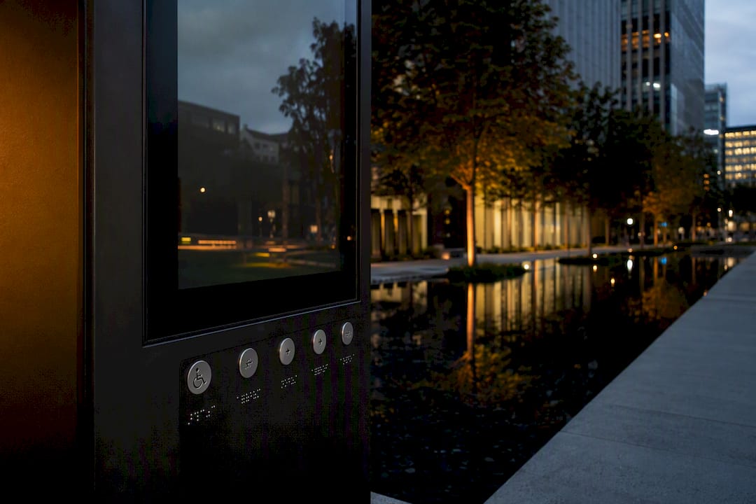
Yes, and accessibility is the one most businesses overlook until a complaint arrives. Text needs sufficient contrast against its background, following WCAG AA guidance, and font sizes need to stay legible for people with lower vision standing at a normal walking distance, not just up close. Avoid relying on colour alone to convey meaning (a red versus green status indicator, for instance) since colour-blind viewers may miss the distinction entirely.
Public-facing digital signage in customer service environments generally needs to consider the same accessibility expectations that apply to other customer communication under accessibility legislation in your jurisdiction, so if a screen is the only source of critical information (a queue number, a safety instruction, an emergency notice), it needs a backup channel, whether that's an audio announcement or a staff member who can repeat it verbally.
Content moderation is a legal issue too, not just a brand one. Social walls pulling from public hashtags can surface content you never approved, including copyrighted images or inappropriate posts, so a moderation queue isn't optional if you're running user-generated content on a public screen. And if signage displays any pricing, promotional terms, or health and safety information, it's subject to the same truth-in-advertising and disclosure standards that apply to printed signage in your province, so treat a digital slide with the same review process you'd give a printed poster.
How do you use calls-to-action effectively on digital signage?
A call-to-action on a screen only works if someone can act on it before they walk past. That means one CTA per slide, placed prominently, with an action simple enough to complete in seconds: scan a code, note a discount, remember a name.
QR codes are the strongest CTA format because they're instantly trackable. Pair every QR code with a UTM-tagged link so you know exactly which slide and which screen produced the scan. A CTA without a QR code or promo code still works for brand recall, but you lose the ability to measure it.
Avoid stacking multiple CTAs on one slide. If you want people to scan a code and also follow a social account, that's two slides, not one.
Place CTA slides where dwell time supports action. A CTA at a fast-moving store entrance needs to be scannable in a glance; a CTA in a waiting room can afford a slightly longer explanation since people have time to read it and pull out their phone.
What are the most common digital signage content mistakes?
The single most common mistake is treating the screen as a one-time install instead of an ongoing content operation. A business spends money on hardware, uploads a handful of slides at launch, and never touches the playlist again. Within a month, regulars have seen every slide a dozen times and stop looking entirely.
Overloading a single slide with multiple messages is the second most common error, and it's almost always the reason a well-designed screen still fails to communicate anything. If a slide is trying to announce a sale, promote a loyalty program, and share store hours all at once, viewers absorb none of it.
Ignoring viewing distance and mounting height sinks otherwise good content before anyone even reads it. Text sized for a desktop monitor often becomes illegible from ten feet away in a lobby.
Running the same content indefinitely without a rotation plan, skipping any kind of QR or UTM tracking so there's no way to know what's working, and using aggressive or flashing motion that drives attention away instead of toward the message round out the list of pitfalls that quietly undercut an otherwise solid signage investment.
Why the "post it and forget it" approach to signage always fails
Most of the advice circulating about digital signage content treats it like a design problem: pick nice templates, use bold colours, done. That's backwards. The research behind this article points to something less glamorous but far more decisive, which is that signage succeeds or fails on operations, not aesthetics. A gorgeous slide on a stale playlist loses to a plain slide that gets refreshed weekly.
The conventional advice also underrates measurement. Businesses will spend real money on hardware and installation, then never track a single QR scan to see if any of it worked. That's the gap worth closing first, before adding more content types or fancier motion graphics.
If you're starting from zero, prioritize in this order: pick one objective per screen, build three or four templates, commit to a weekly update ritual, and attach a trackable link to your very first promotional slide. Everything else, the social walls, the live dashboards, the interactive kiosks, is worth adding once that operational habit is actually in place.
Sources
- Digital Signage Content Ideas: What to Display on Your Screens
- Digital Signage Content: 30+ Ideas, Examples & Strategy Guide
- The best digital signage content strategies for engaging audiences
- 20 ideas for digital signage content (with pictures!)